Finance
A UX Redesign for Everyday Indians
Redesigning a legacy banking app to make everyday tasks simpler for seniors, students, and small business owners.

Context
During a recent visit to an Indian Bank branch, I noticed their official mobile app felt outdated and unintuitive. The experience made me reflect on how crucial it is for essential services like banking to feel reliable, simple, and human-friendly — especially in a country where digital literacy varies greatly.
Problem
Many people I know — especially older relatives — often use apps like PhonePe simply because the official banking apps are frustrating. In contrast, apps like Google Pay and Paytm have become popular among students and adults due to their modern design and seamless UX.
This inspired me to rethink:
What if the Indian Bank app was built with today's users in mind?
My Role
UX Research & Persona Creation
Wireframing & UI Design (Mobile)
Prototyping & Usability Testing
Tools: Figma, Notion, Chatgpt
Research & Insights
To understand the gaps in Indian Bank’s app, I spent time using it myself and spoke with a few users—especially those who depend on it for everyday tasks like checking balances, transferring money, or recharging mobile phones.
I also compared it to more user-friendly apps like PhonePe, Google Pay, and Paytm, which have set a new standard for simplicity and clarity in fintech UX.
🔍 Key Insights (from observation + assumed behavior)
People don’t open banking apps for everything — they open it for specific, frequent tasks (like checking balance or sending money)
Most users have low tolerance for “searching through menus”
Regional languages and dark mode are not a “bonus” — they’re expected
Users use PhonePe or Paytm because they feel faster and simpler, even if they aren’t banks
Design Decisions
After reviewing user pain points and behavior patterns, I defined the following core goals for the Indian Bank app redesign:
1. Simplify the First-Time Experience
Make the app feel less intimidating for older or low-tech users by removing visual clutter and introducing clearer onboarding/navigation.
2. Prioritize Core Actions
Surface the most-used tasks (like recharge, fund transfer, balance check) directly on the home screen — no need to dig into menus.
3. Support Local Contexts
Design with Indian users in mind by supporting:
Language toggle from the start
Dark/light mode based on preference
Touch-friendly components for smaller/older phones
4. Modernize the Look and Feel
Update typography, color system, spacing, and iconography to match modern UI standards without overwhelming traditional users.
5. Create a Familiar Yet Fresh Flow
Take learnings from apps like PhonePe or Google Pay, but apply them in a way that fits a banking context, not just UPI.
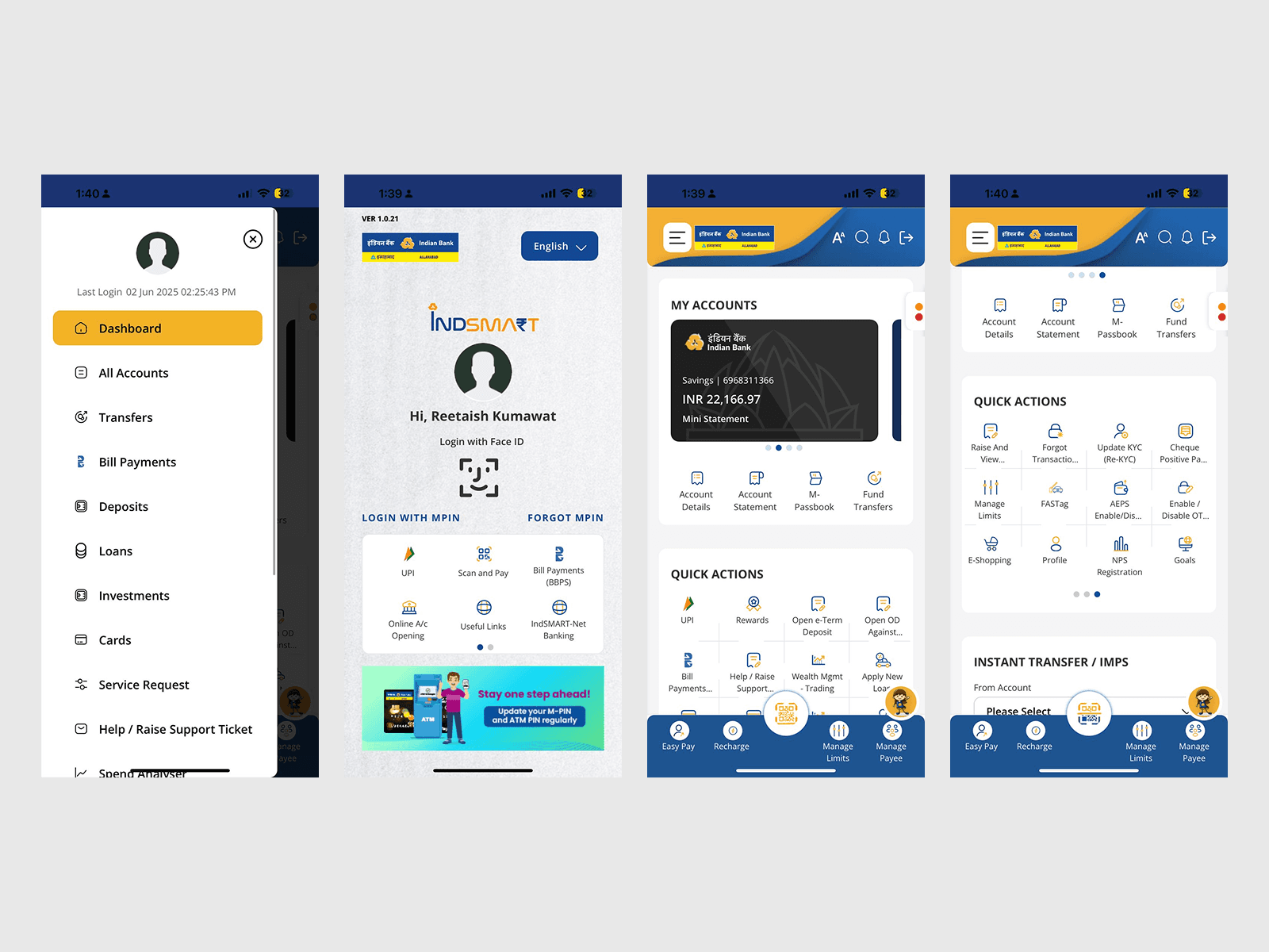
🧾 Before (Old Indian Bank UI)
Aspect | Observation |
|---|---|
UI Design | Outdated and visually dense. |
User Flow | Confusing layout with hidden core actions. |
Trust Signals | Weak visual emphasis on confirmations. |
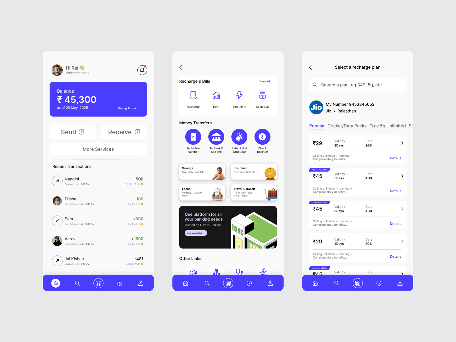
✨ After (My Redesigned UI)
Aspect | Improvement |
|---|---|
UI Design | Modern, accessible, and visually cohesive. |
User Flow | One-tap access to core features. |
Trust Signals | Bold confirmation and clear history views. |
Key UX Takeaways
Familiarity + Simplicity = Trust
Users expect mobile apps to be fast, predictable, and peer-validated
Dark/light toggle should be global, not screen-specific
Features like “send to contacts,” receipts, and balance visibility are essential
Reflection
This project helped me combine user empathy with interface decisions. Rather than reinventing everything, I focused on what real Indian users already trust — and how to bring that familiarity into traditional banking.
Link: Prototype
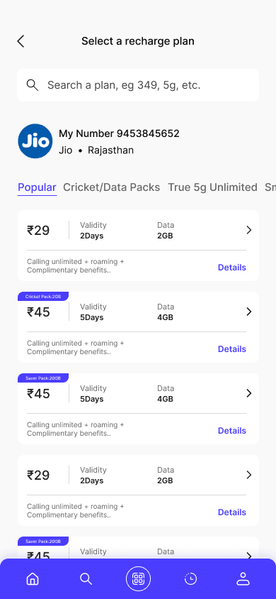
Screens
With user-centered approach, the goals was to create an intuitive interface for effortless financial management.